Graphical Analysis - Plots
Pyevolve comes with an Graphical Plotting Tool, this utility uses the great python plotting library called Matplotlib.
See also
Requirements section.
You can find the Pyevolve plotting tool in your python Scripts directory, the tool is named pyevolve_graph.py.
Graphical Plotting Tool Options
pyevolve_graph.py, installed in \Python2x\Scripts\pyevolve_graph.py.
This is the documentation where you call the –help option:
Usage: pyevolve_graph.py [options]

Options:
  -h, --help            show this help message and exit
  -f FILENAME, --file=FILENAME
                        Database file to read (default is 'pyevolve.db').
  -i IDENTIFY, --identify=IDENTIFY
                        The identify of evolution.
  -o OUTFILE, --outfile=OUTFILE
                        Write the graph image to a file (don't use extension,
                        just the filename, default is png format, but you can
                        change using --extension (-e) parameter).
  -e EXTENSION, --extension=EXTENSION
                        Graph image file format. Supported options (formats)
                        are: emf, eps, pdf, png, ps, raw, rgba, svg, svgz.
                        Default is 'png'.
  -g GENRANGE, --genrange=GENRANGE
                        This is the generation range of the graph, ex: 1:30
                        (interval between 1 and 30).
  -c COLORMAP, --colormap=COLORMAP
                        Sets the Color Map for the graph types 8 and 9. Some
                        options are: summer, bone, gray, hot, jet, cooper,
                        spectral. The default is 'jet'.
  -m, --minimize        Sets the 'Minimize' mode, default is the Maximize
                        mode. This option makes sense if you are minimizing
                        your evaluation function.

  Graph types:
    This is the supported graph types

    -0                  Write all graphs to files. Graph types: 1, 2, 3, 4 and 5.
    -1                  Error bars graph (raw scores).
    -2                  Error bars graph (fitness scores).
    -3                  Max/min/avg/std. dev. graph (raw scores).
    -4                  Max/min/avg graph (fitness scores).
    -5                  Raw and Fitness min/max difference graph.
    -6                  Compare best raw score of two or more evolutions (you
                        must specify the identify comma-separed list with
                        --identify (-i) parameter, like 'one, two, three'),
                        the maximum is 6 items.
    -7                  Compare best fitness score of two or more evolutions
                        (you must specify the identify comma-separed list with
                        --identify (-i) parameter, like 'one, two, three'),
                        the maximum is 6 items.
    -8                  Show a heat map of population raw score distribution
                        between generations.
    -9                  Show a heat map of population fitness score
                        distribution between generations.
Usage
To use this graphical plotting tool, you need to use the DBAdapters.DBSQLite adapter and create the database file. Pyevolve have the “identify” concept, the value of this parameter means the same value used in the “identify” parameter of the DB Adapter.
See this example:
sqlite_adapter = DBAdapters.DBSQLite(identify="ex1")
ga.setDBAdapter(sqlite_adapter)
This DB Adapter attached to the GA Engine will create the database file named “pyevolve.db”.
See also
- Sqliteman, a tool for sqlite3 databases
- I recommend the Sqliteman tool to open the database and see the contents or structure, if you are interested.
When you run your GA, all the statistics will be dumped to this database, and you have an ID for this run, which is the identify parameter. So when you use the graph tool, it will read the statistics from this database file. The “identify” parameter is passed to the tool using the “-i” option, like this:
pyevolve_graph.py -i ex1 -1
By default, this tool will use the database file named pyevolve.db, but you can change using the “-f” option like this:
pyevolve_graph.py -i ex1 -1 -f another_db.db
Usage Examples
Writing graph to a file
PDF File:
pyevolve_graph.py -i ex1 -1 -o graph_ex1 -e pdfPNG File (default extension when using “-o” option):
pyevolve_graph.py -i ex1 -1 -o graph_ex1
Using the generation range
# this command wil plot the evoltion of the generations between 10 and 20.
pyevolve_graph.py -i ex1 -1 -g 10:20
When you have minimized the evaluation function
pyevolve_graph.py -i ex1 -1 -m
To specify an identify list (graphs “-6” and “-7”)
pyevolve_graph.py -i ex1_run1,ex1_run2,ex1_run3 -6s
Graph Types and Screenshots
Here are described all the graph types and some screenshots.
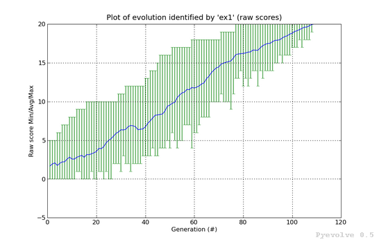
Error bars graph (raw scores) / “-1” option
In this graph, you will find the generations on the x-axis and the raw scores on the y-axis. The green vertical bars represents the maximum and the minimum raw scores of the current population at generation indicated in the x-axis. The blue line between them is the average raw score of the population.
This graph was generated using:
pyevolve_graph.py -i ex1 -1
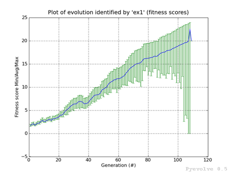
Error bars graph (fitness scores) / “-2” option
The differente between this graph option and the “-1” option is that we are using the fitness scores instead of the raw scores.
This graph was generated using:
pyevolve_graph.py -i ex1 -2
Note
This graph is from a GA using the Linear Scaling scheme and the Roulette Wheel selection method.
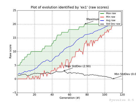
Max/min/avg/std. dev. graph (raw scores) / “-3” option
In this graph we have the green line showing the maximum raw score at the generation in the x-axis, the red line shows the minimum raw score, and the blue line shows the average raw scores. The green shaded region represents the difference between our max. and min. raw scores. The black line shows the standard deviation of the average raw scores. We also have some annotations like the maximum raw score, maximum std. dev. and the min std. dev.
This graph was generated using:
pyevolve_graph.py -i ex1 -3
Note
We can see in this graph the minimum standard deviation at the convergence point. The GA Engine have stopped the evolution using this criteria.
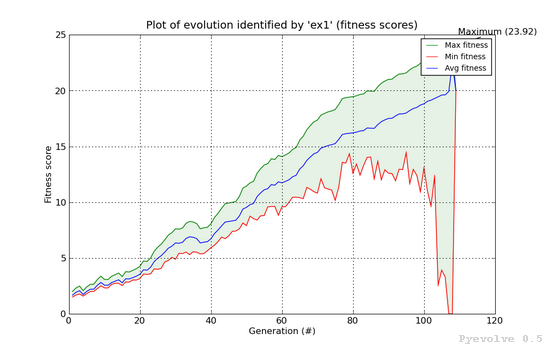
Max/min/avg graph (fitness scores) / “-4” option
This graphs shows the maximum fitness score from the population at the x-axis generation using the green line. The red line shows the minimum fitness score and the blue line shows the average fitness score from the population. The green shaded region between the green and red line shows the difference between the best and worst individual of population.
This graph was generated using:
pyevolve_graph.py -i ex1 -4
Note
This graph is from a GA using the Linear Scaling scheme and the Roulette Wheel selection method.
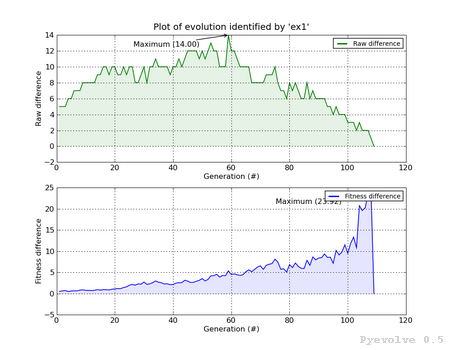
Min/max difference graph, raw and fitness scores / “-5” option
In this graph, we have two subplots, the first is the difference between the best individual raw score and the worst individual raw score. The second graph shows the difference between the best individual fitness score and the worst individual fitness score Both subplost shows the generation on the x-axis and the score difference in the y-axis.
This graph was generated using:
pyevolve_graph.py -i ex1 -5
Compare best raw score of two or more evolutions / “-6” option
This graph is used to compare two or more evolutions (the max is 6 evolutions) of the same or different GA.
It uses a different color for each identify you use, in the example, you can see the three evolutions (green, blue and red lines) of the same GA.
All the lines have a shaded transparent region of the same line color, they represent the difference between the maximum and the minimum raw scores of the evolution.
This graph was generated using:
pyevolve_graph.py -i ex1_run1,ex1_run2,ex1_run3 -6
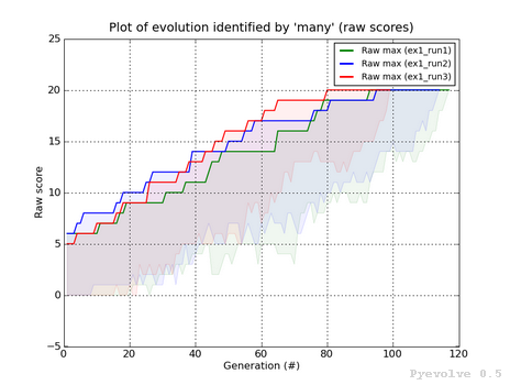
Note
The evolution identified by “ex1_run3” (red color) is the evolution in which the best raw score (20) was got first at the generation 80, compared to the other runs.
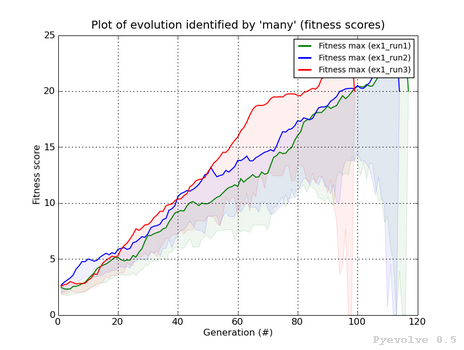
Compare best fitness score of two or more evolutions / “-7” option
The differente between this graph option and the “-6” option is that we are using the fitness scores instead of the raw scores.
This graph was generated using:
pyevolve_graph.py -i ex1_run1,ex1_run2,ex1_run3 -7
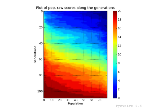
Heat map of population raw score distribution / “-8” option
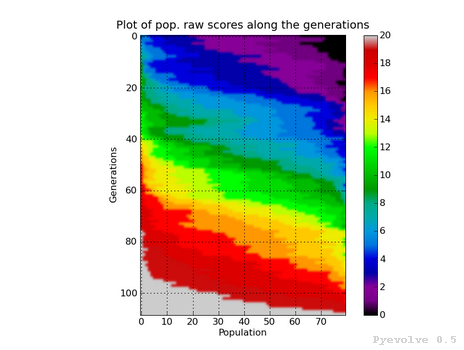
The heat map graph is a plot with the population individual plotted as the x-axis and the generation plotted in the y-axis. On the right side we have a legend with the color/score relation. As you can see, on the initial populations, the last individals scores are the worst (represented in this colormap with the dark blue). To create this graph, we use the Gaussian interpolation method.
This graph was generated using:
pyevolve_graph.py -i ex1 -8
Using another colormap like the “spectral”, we can see more interesting patterns:
This graph was generated using:
pyevolve_graph.py -i ex1 -8 -c spectral
Warning
This graph generation can be very slow if you have too many generations. You can use the “-g” option to limit your generations.
Heat map of population fitness score distribution / “-9” option
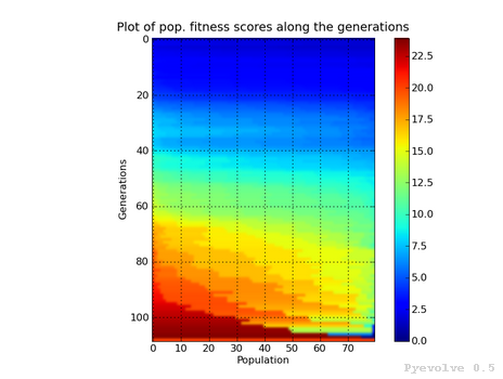
The differente between this graph option and the “-8” option is that we are using the fitness scores instead of the raw scores.
This graph was generated using:
pyevolve_graph.py -i ex1 -9
Note
Here you can note some interesting thing, in this graph of the scaled score, the individuals fitness seems almost equaly distributed in the population.
Now, the same plot using the “hot” colormap.
This graph was generated using:
pyevolve_graph.py -i ex1 -9 -c hot

Warning
This graph generation can be very slow if you have too many generations. You can use the “-g” option to limit your generations.